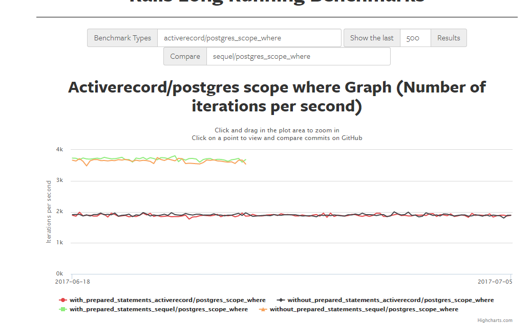
I find current comparison chart a bit confusing. I think we don’t need all results displayed from comparing benchmark. Maybe only last commit result from benchmark we want to compare with is enough on graph. This could be simply plotted as one line graph and would be much more clear what is being compared.
You can get the feel about differences between benchmarks but it is not that clear which commit results are being compared.
At a minimum display the relevant comparison at the top.
With “prepared statement” vs “without” is just a wash and just causing confusion. My first question here is: Do we have any bench where the difference is significant? If not just suppress one of them for now or add a checkbox at bottom of graph to select prepared vs not.
Also, maybe a simple comparison UI to see all the comparison tests available?
For example same comparison, one of the heavy active record ones, can run on various commits of Ruby. Then you can tell how much Ruby can help. What do you think @noahgibbs ?
Certainly being able to compare across Ruby versions could be nice. Especially with some of the JIT stuff we’re looking at for near-future Ruby versions, there could be all kinds of effects on ActiveRecord… Even a lot of the GC work might be quite relevant.
The usability stuff you mention (restricting comparisons, etc.) sounds good in concept. I’m not sure if there’s a simple way to group the tests for comparison, though.
Grouping comparable benchmarks is something that definitely needs to be done. I want to make it possible through admin UI, since I think it’s the most convenient way to do it. So you would have comparison candidates from same group in dropdown.
I haven’t found any benchmark which results significantly differ whether with or without prepared statements. So I agree that displaying both produces bit of a noise. I will manage that.
Oh yeah, that strange issue occurs when benchmark doesn’t have enough results to display. I will make it display minimum of last results these two benchmarks have.
I really want to keep a “proper” comparison looking at trends in both benchmarks over time
I’ve assumed when we want to compare benchmark A to benchmark B we are only interested in looking benchmark A over time.
At the moment I can select up to 2000 commits, what I would like to do is be able to select a time frame there as well (1 year, 2 years, 3 years, 5 year), then we can pick say 2000 commits in the N year period and graph them.
At that point we can compare trends. And show for example when AR worked on perf, compared to when Sequel did.
Additionally, we will easily be able to tell when time is invested in “catching up” on performance debt.
I didn’t look in detail, but it may be just that the query is more
complex than other benches and most of the time is spent in the database
and not in ruby. Sequel does allocate less than a third of objects that
AR does, and is 10% faster, but if the database is the bottleneck, then
the performance difference between Sequel and AR is likely to be small.
I’ve come across an odd issue while I was trying to reproduce these results locally.
After I ran both benchmarks directly on my machine (not in docker) I got Sequel 2x faster than ActiveRecord:
sequel/postgres_discourse - 312 ips
activerecord/postgres_discourse - 162 ips
While running same benchmarks in a standard way (inside docker) gave me smaller differences in results:
sequel/postgres - 198 ips
activerecord/postgres - 153 ips
I am super confused with this. Maybe we are missing something in setup. I have verified benchmark correctness (same SQL query and same string generated) by running it directly on local machine.
How is the DB setup? You have to make sure you run a volume for the DB on the host, otherwise you pay a huge price on filesystem access, also be sure to disable fsync and other stuff … see:
I guess this is the correct thing to do, but keep in mind I have seen very very little perf movement in these gems, they are pretty much as fast as they are going to be.
You got to get something in asap though to fully debug this.

 s to
s to  s
s